STUDY AND WRITING SKILLS
54
5.5
STUDY SKILLS
USING GRAPHS, CHARTS AND TABLES
2
What would you use to illustrate this
information? Give reasons.
1
the amount of rainfall falling in an area
each month during a 12-month period
2
the results of a survey of 100 students
giving information about the subject
they chose to study in their first year
3
the increase in the sales of tablets
compared with laptops and mobile
phones
4
a comparison of the changes in
population in four world regions
(Africa, Europe, South America and
North America) during three periods:
1900, 1950, 2000
3
a
Read this internal report for the staff
at FlyAway Travel Agency. Create a table
to illustrate the information.
1
Graphs, charts and tables are ways of presenting information in a
form that is easy to understand. Match each type shown above with
one of the descriptions.
1
A
shows the different parts of a total amount. For example,
it could show the percentage of money that a student spends on
entertainment, study materials, clothes, accommodation and food.
2
A
is useful for comparing things and showing amounts or
quantities at specific times. For example, the percentage of people who
own certain products (cars, televisions, etc.) in three different periods.
3
A
contains a list of numbers or facts arranged in rows
and columns. It could, for example, be a list of results for
football league tables.
4
A
is useful for showing how things change over time, and for
showing two or more sets of measurements which are related to each
other. For example, it might show how the number of passengers of
an airline has changed from month to month.
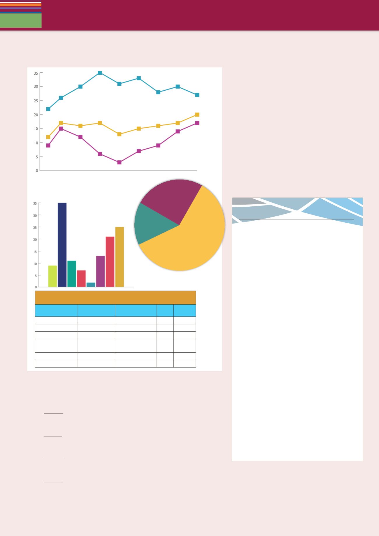
FlyAway
NEWSLETTER • SUMMER
Last year, Spain and Italy were the most popular
destinations for our customers: 44 percent (Spain
20 percent, Italy 24 percent) chose those countries
for their holiday. This compares with 35 percent
(Spain 17 percent, Italy 18 percent) the previous
year. Similarly, the United States was an extremely
popular destination: approximately 22 percent
chose to go there whereas only 11 percent of our
customers visited the US the previous year. Fewer
people, just 12 percent, chose North Africa this year.
The figure last year was 15 percent.
Germany and France showed little change over
the period. Germany attracted 4 percent of our
customers last year compared to 5 percent the
year before. However, the number of customers
visiting France rose from 5 to 7 percent.
On the other hand, results were very
disappointing in the Netherlands, which was
visited by only 2 percent of our customers, in
contrast to 9 percent the previous year. Although
our performance in the Netherlands was below
expectations, this was offset by an increase in
the number of customers visiting Denmark and
Sweden. Six percent chose this destination,
which was significantly more than 2 percent the
previous year. We see considerable potential in
these countries for increasing sales, so we will be
spending more on advertising in the area in the
future.
Other destinations accounted for only 5 percent
of our customers last year, while the figure for
the previous year was 16 percent.
3
b
Now draw a pie chart to show last
year’s figures only.
3
c
Compare your table and chart
with a partner.
pie chart
line
graph
bar graph
table
Survey on the importance of different factors when choosing a
holiday by age group: percentage saying very important
Factor
18 - 25
Families with
young children
– 40
65
65+
Price
67
54
23
68
Weather
78
64
43
61
Food
18
32
59
69
Scenery and land-
scapes
23
48
78
83
Entertainment
84
77
32
38
Safety
24
98
74
92


